ADA Signage Design and Compliance Simplified
Imagine walking into an unfamiliar building where every sign looks the same; no tactile letters, no braille, poor lighting. For millions of Americans living with disabilities, that’s not imagination, it’s everyday reality.
The Americans with Disabilities Act (ADA) changed that, making inclusive design a legal and moral standard. And one of the most visible, yet overlooked parts of that law is ADA-compliant signage.
According to the Centers for Disease Control and Prevention (CDC), one in four adults in the U.S. lives with a disability. That’s nearly 85 million people navigating workplaces, stores, clinics, and campuses every day. The Americans with Disabilities Act (ADA) ensures they can do so safely, independently, and with dignity. And at the heart of that promise lies something seemingly simple: ADA compliance signage.
While ADA signs may look like just another design requirement, they are the difference between inclusion and exclusion. From ADA restroom signs to ADA parking signs, compliant signage isn’t just about avoiding fines; it’s about accessibility, trust, and good design.
In this guide, we’ll explain how to design and install ADA-compliant signs, covering braille, contrast, height, materials, and real-world examples. You’ll walk away knowing not only what compliance looks like but how to achieve it in every space.
Understanding ADA Compliance Signage
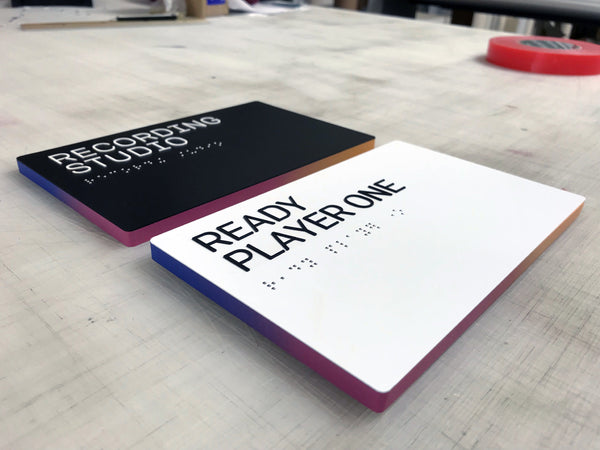
ADA signs identify, direct, and inform, helping people with visual or mobility impairments navigate spaces confidently. They use a mix of tactile elements, braille, non-glare finishes, and high-contrast visuals to ensure readability for everyone.
Common ADA sign categories include:
-
Identification signs: Label permanent rooms like restrooms, offices, and exits.
-
Directional signs: Guide people through hallways, elevators, and shared spaces.
-
Informational signs: Provide instructions or building information (e.g., fire exits, floor numbers).
-
Safety and parking signs: Mark accessible routes and designated spaces.
-
Quick rule of thumb: If a sign identifies a space used for more than seven days, it likely requires ADA compliance.
What Makes a Sign ADA Compliant
The ADA’s 2010 Standards for Accessible Design define clear visual and tactile requirements for ADA-compliant signs. Here’s what you must get right:
Non-Glare Finish
All characters and backgrounds must have a matte or eggshell finish. Glossy surfaces can reflect light and make text illegible.
Contrast
The ADA recommends a 70% contrast ratio between text and background.
Examples:
-
White text on navy blue or matte black
-
Silver on brushed steel = low contrast = noncompliant
Font Rules
-
Sans-serif typefaces only (e.g., Helvetica, Arial).
-
No italics, decorative, or condensed fonts.
-
Uppercase for tactile text; sentence case for visual-only text.
Character Height and Spacing
-
Raised characters: 5/8" to 2" tall.
-
Stroke thickness ≤ 15% of letter height.
-
Minimum spacing of 1/8" between characters.
Braille Requirements
Every ADA identification sign must include Grade 2 Braille placed directly below the text.
-
Dots: 0.059"–0.063" diameter, with domed tops.
-
Spacing: Consistent and tactile-friendly.
-
Use lowercase except for proper nouns or acronyms.
Pro tip: Even minor spacing errors in Braille can invalidate compliance; always verify dimensions with your signage fabricator.
ADA Bathroom and Restroom Signs: Small Signs, Big Impact
Few signs are as universally recognized or as frequently inspected as ADA restroom signs. They are required in all public and employee-accessible facilities.
Design Requirements
-
Include both tactile lettering and Grade 2 Braille.
-
Use pictograms where applicable (e.g., male, female, unisex, wheelchair accessibility).
-
Maintain 6” minimum pictogram height with descriptive text below.
Height & Placement
-
Mount on the latch side of the door.
-
Baseline of lowest tactile character: 48” minimum from floor.
-
Baseline of highest tactile character: 60” maximum from floor.
-
Maintain a clear floor space of 18” x 18” for access.
California Restroom Standards
California’s Building Code (CBC) includes extra visual symbols:
-
Men’s rooms: 12” blue triangle (¼” thick)
-
Women’s rooms: 12” blue circle (¼” thick)
-
Unisex: Triangle over circle combination
These geometric shapes must contrast sharply with the door surface and be centered between 58”–60” from the floor.
ADA Parking Signs and Exterior Applications
ADA parking signs are critical for exterior compliance and among the most visible indicators of accessibility.
Key Requirements
-
Must display the International Symbol of Accessibility (ISA).
-
Mounted 60” minimum from the ground to sign bottom edge.
-
Include designation such as “Van Accessible” where applicable.
-
Font height ≥ 1” for legibility from vehicle distance.
Handicap Parking Sign Regulations
-
ADA handicap parking sign requirements vary by state, but federal standards apply nationwide.
-
Pavement markings alone do not meet compliance; permanent post-mounted signage is mandatory.
Example: In one of our projects, a commercial complex passed all interior ADA checks but failed final inspection because the parking signs were mounted at 52” — 8” too low.
ADA Sign Installation Guidelines: Getting Placement Right
Even the best-designed custom ADA signage fails if installed incorrectly. Follow these universal mounting rules:
-
Install on the wall adjacent to the door’s latch side.
-
For double doors: Mount on the right-hand side.
-
If no wall space: Mount directly on the door (push side only).
-
Maintain 18” x 18” floor clearance for tactile approach.
-
Ensure no obstructions (furniture, door swing, or décor) interfere with reach.
Height Specifications
|
Element |
Standard Range |
|
Raised Characters |
48”–60” (measured baseline to floor) |
|
Braille |
Immediately below the corresponding text |
|
Parking Signs |
60” minimum from the ground |
|
Restroom / Room ID Signs |
Centered at 54”–58” ideal visual height |
Choosing the Right Materials and Finishes
Durability and design both matter in ADA compliance signage. The best materials balance accessibility with aesthetics.
|
Material |
Recommended Use |
Benefits |
|
Acrylic |
Indoor offices, restrooms |
Smooth matte finish, easy Braille embedding |
|
Aluminum |
Outdoor or industrial areas |
Weatherproof, long-lasting |
|
Photopolymer |
Healthcare or high-traffic spaces |
Seamless tactile integration |
|
Woodgrain / Faux Metal Laminate |
Corporate or hospitality settings |
ADA compliant + designer look |
Always ensure that the finish remains non-glare and high contrast, even when opting for custom branding colors.
Common ADA Signage Mistakes to Avoid
After years of audits and signage retrofits, we’ve seen a few common pitfalls repeat themselves, and they’re easy to prevent:
|
Mistake |
Why It’s a Problem |
|
Glossy finish |
Causes glare, unreadable from angles |
|
Low contrast colors |
Fails visual accessibility tests |
|
Decorative fonts |
Hard to read tactually and visually |
|
Incorrect Braille spacing |
Instantly noncompliant |
|
Signs mounted too high |
Fails ADA reach range |
|
Missing room ID Braille |
Common oversight in offices |
Tip: Before installation, print a 1:1 paper template of your sign layout and mark placement on the wall; it’s the easiest way to prevent errors.
Examples of ADA Signage Done Right
-
Corporate Office Restroom Upgrade
A tech workspace in Austin replaced reflective metal restroom plates with matte acrylic ADA signs that included tactile lettering and Grade 2 Braille. The previous glossy finish caused glare under overhead lights, which made the signs harder to read for employees with low vision. The new signs blend into the office’s calm, neutral interior palette without drawing attention to compliance. The result is accessibility that feels natural, not forced. -
Medical Clinic Wayfinding
A family health clinic updated its hallway and room signs to improve navigation. They introduced a simple color system to help people understand the building flow: blue for patient rooms, green for staff-only spaces. They also added tactile arrows and properly spaced Braille under each sign. The change reduced wayfinding questions at the reception desk and gave patients with low vision more independence. -
Elementary School Renovation
During a renovation project, a public elementary school standardized its ADA-compliant restroom and directional signs. All tactile letters were mounted between 48 and 60 inches from the floor, with high-contrast white-on-black text to improve visibility. This small consistency helped teachers and maintenance staff replace signs without rechecking placement specs. It also ensured smoother annual inspections.
ADA Sign Regulations and Enforcement
The Department of Justice (DOJ) enforces ADA compliance. Violations can result in:
-
Fines up to $75,000 for first offenses.
-
Legal action or lawsuits under Title III.
-
Reputational damage and failed occupancy approvals.
Staying compliant isn’t optional; it’s a legal, ethical, and brand responsibility.
ADA Compliance Checklist (Quick Reference)
-
Use non-glare, high-contrast materials
-
Apply sans-serif fonts (Helvetica, Arial)
-
Maintain 48–60” installation height
-
Include Grade 2 Braille on all permanent room signs
-
Verify ADA bathroom sign height & placement
-
Mount ADA parking signs at ≥ 60”
-
Check local regulations (e.g., California CBC)
-
Audit braille spacing and tactile thickness
Need a professional compliance audit? Request an ADA Signage Consultation →
Takeaway: ADA Signage as Inclusive Design
When done right, ADA compliance signage becomes more than a checklist; it’s a statement of inclusion. From ADA restroom signs to ADA parking signs, every compliant design tells your visitors: You belong here.
At Martin Sign, we design and install custom ADA signage that meets every regulation while reflecting your brand’s aesthetic.
If you're reviewing your facility or planning updates, browse our selection of ADA-compliant signs. If you’re unsure where to start, just reach out, we’ll point you in the right direction.