Door Signage for Offices. Small Signs That Keep Workdays Flowing
Office door signs are one of those details you stop noticing once they’re done right. People find the right room on the first try. Meetings start on time. Visitors feel confident about where they’re going. And your brand looks organized instead of improvised.
When door signage isn’t planned, the opposite happens. Temporary printouts appear. Handwritten labels stick around longer than they should. Different fonts and colors pop up on every floor. Over time, the whole space starts to feel a little chaotic.
This guide walks through how to approach door signage for offices the same way you’d approach any other part of your environment: with intention. We’ll look at sign types, ADA and accessibility basics, placement, design, and how to build a system that still works when teams and tenants change.
If you’d like a deeper dive focused just on door signs, our Custom Door Signs for Homes & Businesses guide is a good companion read.
Why office door signs matter more than you think
Door signs are tiny decision points. Every time someone chooses a hallway or reaches for a handle, they’re using your signage to confirm they’re in the right place. When those signals are clear, the whole office feels smoother.
For employees, good door signage reduces friction. New hires learn the space faster. People don’t keep interrupting meetings by opening the wrong door. Shared rooms, phone booths, and focus spaces are easier to find and use.
For visitors, clear signage is a trust signal. If a client can navigate from reception to a conference room without a guided tour, your space feels thoughtful and professional.
Common types of office door signage
Most offices use a mix of permanent, semi-permanent, and changeable door signs. The right combination keeps your core information stable while allowing for team changes and growth.
Room identification signs
These are the backbone of office door signage: conference rooms, focus rooms, huddle spaces, copy rooms, wellness rooms, storage, and so on. They answer the basic question: “What is this room?”
Room IDs are usually permanent or long-term, especially when they need to be ADA-compliant with tactile text and Braille. They’re often designed to carry the brand look of the office, with consistent materials, colors, and mounting height across the floor.
Name and title plates
Nameplates sit under or alongside room IDs and carry more changeable information: employee names, titles, or team labels. In modern offices, these are often designed so inserts can be swapped without replacing the whole sign.
That flexibility matters when teams move, roles shift, or desks become shared. A good nameplate system lets you update information without losing the visual consistency of your signage.
Status and availability signs
In rooms that are booked frequently, a simple status indicator can save a lot of knocking. Sliding “In Use / Available” tabs, printed inserts, or digital indicators on or near the door tell people whether it’s okay to enter.
These signs don’t replace your booking system, but they make it visible in the physical space. They’re especially handy for meeting rooms, phone booths, and interview spaces.
Policy and etiquette signs
Some doors need behavior reminders rather than labels. Think “Please Knock,” “Confidential Calls Only,” “Quiet Room,” or “Staff Only.” When done well, these signs support your culture instead of feeling scolding.
For a deeper look at functional, policy-driven signage, our Service Signs guide explores how informational signs can still look branded.
ADA basics for interior office door signs
In many California office buildings, certain door signs need to be ADA-compliant. That usually applies to permanent rooms like restrooms, kitchens, conference rooms, and exits. The goal is simple: people with visual impairments should be able to find and identify key spaces independently.
ADA-compliant door signs use tactile lettering, Braille, non-glare backgrounds, and strong contrast. They’re also installed at specific heights and locations beside the latch side of the door.
For a full breakdown of ADA rules, our ADA Signage Design and Compliance Simplified guide is the best reference.
The good news is that compliance and design don’t have to compete. Thoughtful materials and layouts can meet code while still fitting into a modern, minimal office aesthetic.
Materials that work well for office door signage
Indoor environments are gentler than exterior facades, but office door signs still take a beating. They’re touched often, cleaned regularly, and live under mixed lighting. Material choice affects how they age and how premium they feel.
Matte acrylic
Matte acrylic is a go-to for interior office signage. It naturally avoids glare, holds tactile layers cleanly, and looks sharp in both bright and low-light corridors. It also pairs well with both warm wood interiors and cooler metal-and-glass spaces.
Metal accents
Aluminum or stainless accents add a more architectural feel. Metal-backed nameplates, small brushed frames, or thin metal inlays can elevate otherwise simple signs.
Dimensional elements
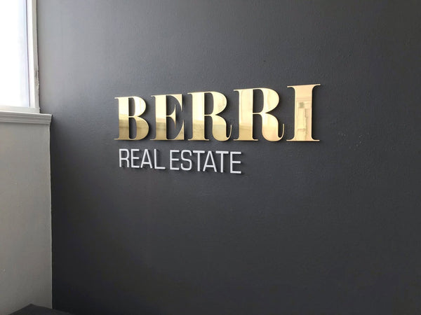
Adding dimensional logos or icons to key doors, like main conference rooms or client areas, creates little brand moments through the office. These can be built using 3D lettering or layered materials.
If you’re considering dimensional elements, our 3D Signage Guide for California Businesses has helpful examples and material comparisons.
Design principles for easy-to-read office door signs
The design goal for office door signage is calm clarity. You want people to get their answer in one quick glance.
Use a limited font set, ideally the same family you use in other branded materials. Pick sizes that can be read comfortably at hallway distance. Keep contrast high between text and background, especially in dimmer corridors.
Try to keep each sign focused on one main message. If a room name, room number, and a long etiquette note all fight for attention on the same plate, nothing reads cleanly. Split supporting instructions onto a second small sign if needed.
Planning placement and consistency across the office
Once you know what you need to say on each door, the next step is planning where and how to mount everything. This is where you turn individual door signs into a system.
Most office projects use a standard mounting height around eye level, with ADA-required signs placed between 48 and 60 inches to the baseline of the lowest tactile line. Keeping heights consistent across a floor helps people quickly scan for information.
Think about sightlines from key decision points: elevator lobbies, main corridors, reception, and junctions. As people move through the space, the relevant door sign should be visible before they reach the handle.
Building a flexible system for growing teams
Offices rarely stay static. Teams split, new departments arrive, hybrid schedules change how rooms are used. A good door signage plan anticipates this.
One approach is to separate permanent and changeable information. Use a long-lasting, ADA-compliant plaque for the room’s function, then layer changeable inserts or name strips for occupants and department names.
This way, when your org chart changes, you’re not re-ordering dozens of full signs. You’re just updating a series of small inserts while the main signage system stays intact.
How Martin Sign approaches office door signage
When we design door signage for offices, we start by mapping the space: how people arrive, how they move, and which decisions they have to make along the way. Then we define a core sign family—materials, sizes, fonts, and mounting rules—that can scale across floors.
If you’re starting from scratch or updating a patchwork system, the easiest way to begin is through Custom Projects. Share a floor plan, a few photos, and your basic list of rooms, and we’ll help you outline a signage set.
For inspiration, our Portfolio shows how door signage ties into larger interior systems for offices, schools, clinics, and more.
Wrapping it up
Door signage for offices doesn’t have to be complicated, but it should be deliberate. With clear hierarchies, ADA-aware planning, and materials that match your interior, you can turn every door into a small moment of clarity instead of a question mark.
If you’re planning a new office, refreshing an older one, or expanding into more floors, we’re happy to help you design a door signage system that keeps workdays flowing and visitors at ease.