Interior Signs. How to Make Your Space Easy to Read
Interior signs are the quiet structure behind every smooth visit. They’re the reason people know which hallway to take, which door to choose, and where they’re allowed to go without feeling lost or awkward. When interior signage works, most visitors never think about it. When it doesn’t, everyone feels it immediately.
In California buildings, interior signs do a lot of heavy lifting. They guide guests through multi‑tenant lobbies, help patients find the right suite, show shoppers where departments begin and end, and keep staff‑only areas clearly marked. Done well, they also carry your brand voice into every corridor and floor.
This guide walks through the big picture of interior signage. We’ll look at the main types of signs inside a building, how wayfinding and branding overlap, what to know about ADA requirements, and how materials and finishes affect the feel of your space.
If you’re already thinking about a full sign package, our Custom Wayfinding Signs guide pairs nicely with this article.
What counts as an interior sign?
When people hear “interior signs,” they often think about just room labels or restroom icons. In reality, almost every visual cue inside your building is part of the signage system.
Typical interior sign types include:
• Directional arrows in lobbies and corridors
• Room identification signs and door signs
• Floor directories and tenant listings
• Restroom and amenity signs
• Code‑required exit, stair, and safety signs
• Service and policy signs (no smoking, staff only, etc.)
• Brand feature walls and dimensional logos
When all of these pieces share a common language—materials, fonts, colors, mounting rules—your building feels intentional and easy to read. When they’re mismatched, the experience is more like a collage of different eras and tenants.
Three jobs interior signs should do
The best interior signs do three things at once.
1. Help people not get lost
Wayfinding is the obvious job, but it’s worth saying clearly: your signs should answer “where am I?” and “where do I go next?” without anyone having to ask. That means putting information at real decision points, not just where there’s empty wall space.
2. Reflect your brand
Interior signs are one of the most visible pieces of your brand in the physical world. Colors, typography, and materials all send a message. A tech company may lean toward clean acrylic and metal. A boutique hotel might prefer warmer tones, layered materials, and softer shapes.
3. Support your operations
Signage is also a tool for keeping the building running smoothly. Clear service signs reduce disruptions to staff. Concise policy signs keep back‑of‑house spaces secure. Smartly labeled rooms and storage areas help teams share space without constant questions.
We cover this side of signage more deeply in our Service Signs guide.
Key interior sign categories
Wayfinding and directional signs
Directional signs are your roadmap. They show which way to turn at intersections, where elevators and stairs are, and how to reach key destinations like restrooms or reception.
Good wayfinding is layered. A lobby directory gives the big picture, then smaller corridor signs confirm that people are still on the right path. You don’t want anyone to walk more than a few seconds without seeing a confirmation cue.
If you’re planning a full wayfinding system, the Custom Wayfinding Signs guide is a helpful blueprint.
Room and door identification signs
Room ID signs tell people what each space is used for: conference rooms, exam rooms, storage, offices, lounges, and more. These are often permanent or long‑term, and many of them need to follow ADA guidelines.
For a closer look at this category, see our Custom Door Signs for Homes & Businesses article.
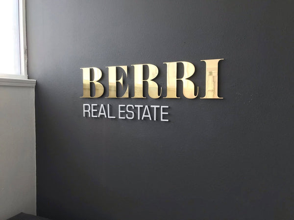
Brand and feature signs
Interior signage isn’t just about labels. Dimensional logos in lobbies, brand statements on feature walls, or large‑scale graphics in corridors turn your space into something memorable.
Our 3D Signage Guide for California Businesses explores how dimensional lettering and logos can create strong interior focal points.
Code and safety signage
Exit signs, stair IDs, evacuation maps, and certain instruction signs are governed by code. These may have specific color, symbol, and placement rules, but they can still be coordinated with the rest of your sign family where rules allow.
ADA basics for interior signage in California
Accessibility is a core part of interior signage. ADA requirements make sure people who are blind or have low vision can navigate independently using tactile and visual cues.
Most permanent rooms—like restrooms, conference rooms, kitchens, and numbered suites—need ADA‑compliant signs. That usually means tactile lettering, Braille, non‑glare backgrounds, and high color contrast. Signs also need to be mounted at consistent heights and on the latch side of the door.
For a full walkthrough, our ADA Signage Design and Compliance Simplified guide breaks down the details.
A common worry is that ADA signs will clash with your interior. In practice, thoughtful material choices—like matte acrylic and metal accents—let you meet code while staying on brand.
Materials that work well for interior signs
Interior signs don’t face rain or direct sun the way exterior ones do, but they still deal with fingerprints, cleaning, and years of daily use. Material choices affect how long they stay attractive and legible.
Matte acrylic
Matte acrylic is a favorite interior material because it avoids glare under overhead lighting, takes tactile lettering well, and is easy to clean. It can be layered with color backers or metal accents to match your interior palette.
Metal panels and accents
Aluminum or stainless panels give a more architectural look. They work especially well in lobbies, elevator cores, and high‑end interiors. Even small metal details—like a brushed frame around an acrylic sign—can make the whole system feel premium.
Dimensional lettering and 3D elements
For feature walls and major destinations, dimensional lettering adds depth and shadow. It’s a powerful way to highlight main tenants, building names, or company logos indoors.
Printed inserts and changeable components
In multi‑tenant buildings or flexible offices, some parts of the sign need to change more often than others. Printed inserts and modular components let you update names and room numbers without replacing the entire sign.
Finishes and color choices
Finish matters as much as the base material. High‑gloss surfaces can look sharp in photos but may reflect lights and windows so strongly that the text becomes hard to read.
Matte or satin finishes usually work best for interior signs, especially in corridors with bright downlighting. They keep glare low while still feeling clean and modern.
For signs that border interior and exterior zones, our Powder Coating vs Paint guide explains why durable finishes matter near entrances.
Design principles for readable interior signage
A beautiful sign that’s hard to read isn’t doing its job. A few design rules keep interiors legible without sacrificing style.
• Use a limited font family, with clear hierarchy between headings, room numbers, and supporting text.
• Keep letter sizes appropriate for viewing distance.
• Maintain strong contrast between text and background.
• Avoid overcrowding. Let each sign communicate one main message.
• Align signs with architectural lines—door frames, mullions, or wall panels—for a calm, ordered look.
Planning an interior sign system, not just individual pieces
The biggest shift in thinking is to plan a system instead of ordering signs one by one. A system defines your core styles, sizes, and mounting rules so new signs can be added over time without breaking the visual language.
A good starting point is to walk your space the way a first‑time visitor would. Note every point where someone might hesitate: at elevators, junctions, doors, and transitions between zones. Those hesitations are where signs should live.
If you’re not sure where to start, our Portfolio shows interior sign families in real California offices, schools, clinics, and retail spaces.
How Martin Sign approaches interior signage projects
When we work on interior signage, we usually begin with a quick conversation and a floor plan. From there, we map decision points, group sign types, and propose a sign family that fits your brand, code needs, and budget.
Most of these projects begin through Custom Projects. You share your space details, and we help translate them into a clear, scalable interior sign package.
We also coordinate with architects, interior designers, and property managers when projects are part of a larger build‑out, so signage lines up with lighting, finishes, and furniture.
Wrapping it up
Interior signs are one of the easiest ways to make a building feel intuitive and put‑together. When wayfinding, ADA signs, brand features, and service signage all speak the same design language, people move with confidence and your space feels more welcoming.
Whether you’re refreshing a single floor or planning signage for a new building, Martin Sign can help you design interior signs that are clear today and flexible enough for what comes next.