Storefront Signs. The First Five Seconds That Decide If People Walk In
A storefront sign isn’t just a label. It’s your handshake with the street. It tells people who you are, what kind of experience to expect inside, and whether your place feels worth a closer look. In the first few seconds someone passes your door, your sign does most of the talking.
That matters everywhere, but in California it matters even more. You’re often competing with bright sun, busy sidewalks, fast traffic, and a lot of visual noise. A good storefront sign cuts through all that without feeling like it’s shouting. It feels confident, clear, and built for the long run.
This guide is here to make storefront signage simple. We’ll walk through the main types of storefront signs, how to choose the right materials and finishes for California weather, what placement and readability rules actually matter, and how to avoid the common mistakes that make signs look cheap or invisible.
If you want to jump straight into a custom storefront project, our Custom Projects page is the fastest way to get a quote and start planning.
What makes a storefront sign work
The best storefront signs do three jobs at once. They help people find you. They communicate your brand personality. And they earn attention without creating confusion.
Think about how people approach your location. Some are walking slowly and scanning every window. Others are driving by at 25 or 35 mph. Others already know you and just need reassurance they’re at the right door. A sign that works has to serve all of them.
That’s why clarity comes first. Your name should be readable at a normal distance. Your contrast should be strong enough for bright daytime glare. And your layout should make sense in one glance.
Our Front Door Business Signs article goes deeper on first impressions and why door-front clarity affects walk‑ins.
Popular types of storefront signs in California
There’s no single “best” storefront sign for every business. The right choice depends on your building, your neighborhood, and how people encounter your storefront. Here are the most common types we build and install across California.
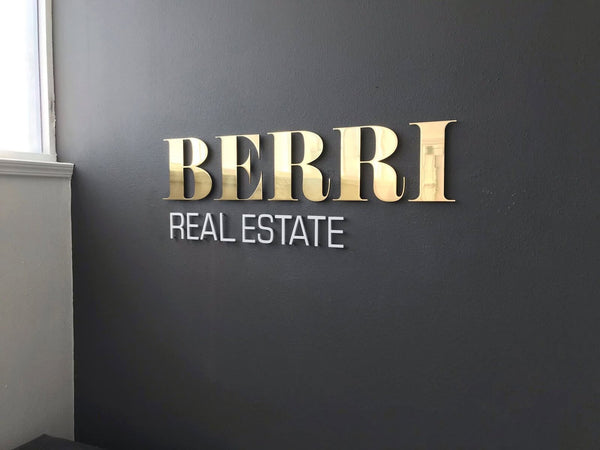
Flat wall signs and panels
Flat wall signs are simple, clean, and versatile. They’re mounted directly on the façade and usually include your logo and name. This style works well when the building already has a strong architectural frame and you want the sign to feel integrated rather than oversized.
Panels can be built from aluminum composite, metal, acrylic, or layered materials. They’re a good choice for retail strips, medical offices, and multi‑tenant buildings where you want a tidy, professional look.
Dimensional letters
Dimensional letters step your storefront up instantly. They create shadow and depth, which makes your name readable even when the sun is harsh. They also feel premium because the material itself becomes part of the brand statement.
In California, dimensional letters are especially useful for businesses on bright streets. The depth catches light naturally, so the sign stays legible even without backlighting.
Exterior hanging signs
If your storefront sits on a pedestrian street, a hanging sign can be your best friend. People walking along the sidewalk don’t always look up at façades. They look ahead at eye level. A blade or square hanging sign meets them where their eyes are already scanning.
We offer ready‑to‑ship and custom options in our Exterior Hanging Signs collection, and we also build fully custom hanging systems through Custom Projects.
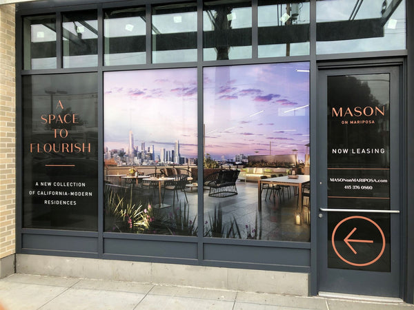
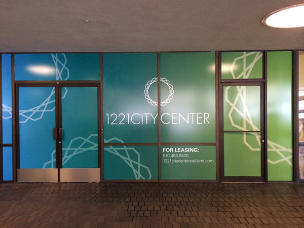
Window graphics and door signage
Sometimes the storefront is more glass than wall. In that case, window lettering or graphics do the work of a traditional sign. They’re great for hours, short brand lines, or subtle logos that feel modern.
The key is to treat them as part of the whole storefront system, not an afterthought. If the wall sign is bold but the window graphics are tiny or disjointed, the storefront feels less cohesive.
Illuminated storefront signs
If your business runs into the evening, illumination is worth considering. Lighting doesn’t just increase visibility at night. It also helps you stand out against neighboring storefronts and streetlights.
Illuminated signs can be front‑lit, halo‑lit, or combined with glowing accent pieces. In California cities with lively night economies, that can have a direct impact on walk‑ins.
For a modern lighting look without the fragility of old‑school glass neon, check our Faux Neon Signs collection for ideas and examples.
Material choices for California storefronts
California weather is a mixed bag. Coastal fog and salt air, inland heat, mountain cold snaps, and hard UV almost everywhere. Your storefront sign needs to handle all of that while still looking crisp.
Aluminum and metal builds
Aluminum is the most common material for exterior storefront signs because it’s lightweight and corrosion‑resistant. It handles coastal conditions well, and it stays stable through heat cycles. Metal also gives you design flexibility, from subtle brushed faces to bold powder‑coated colors.
Acrylic for clean, modern faces
Acrylic is popular for interior‑facing storefront pieces and layered logos. It allows crisp color, sharp edges, and a matte finish that avoids glare. When acrylic sits under shelter, it performs beautifully.
Composite panels for big coverage
Aluminum composite panels (ACM) are used when you need a large flat background that stays rigid and smooth. They’re often paired with dimensional letters or logos mounted on top.
Finishes that keep signs looking new
Finish is what protects your storefront sign from fading and peeling. It’s also what determines whether the sign looks cheap or refined.
Powder coating for exteriors
Powder coating is a top choice for California storefront signs because it resists UV, humidity, and scratches. If you want color that stays stable over years of sun, powder coat is hard to beat.
We explain why in Powder Coat vs Paint, with clear pros and cons for commercial exteriors.
Paint and specialty textures
Painted finishes still make sense for certain styles, especially if a custom texture or artistic effect is part of your brand. The tradeoff is that paint usually needs more maintenance outdoors, so we plan for that up front.
Design and readability tips that matter
You don’t need a complicated design to have a strong storefront. You need a sign that reads well in real life.
Start with scale. Your letters need to be large enough to read at the distance people first see your business. That might be 30 feet on a sidewalk or 80 feet across a street. If your sign feels a little too big on paper, it’s probably right in the real world.
Contrast comes next. California sunlight can wash out soft tones. A high‑contrast palette keeps readability strong at noon, not just at golden hour.
Then consider simplicity. If someone has to read more than a few words to understand what you do, they probably won’t. Let your name do the primary work, and use secondary text only if it adds clarity without clutter.
Placement and permitting in California
Placement is where even good signs can fail. You want to be visible without fighting the building.
Most storefront signs belong in the main customer sightline. That usually means above the entry, centered over the business footprint, or positioned so it’s visible from the strongest approach direction.
In California cities, permitting is often required for exterior signage. Rules vary by city and sometimes by neighborhood, especially in historic districts or dense downtown areas.
When we handle storefront signs through Custom Projects, we help with permitting and code coordination as part of the process.
Common storefront sign mistakes to avoid
Most storefront sign mistakes aren’t about taste. They’re about missing a practical detail.
One common mistake is going too small. A sign that looks elegant in a mockup can disappear on a real street. If your neighbors have larger signs, you don’t want yours to shrink into the background.
Another is using low‑contrast colors. Soft beige on white or light gray on silver may look subtle, but it often becomes unreadable in daylight.
A third mistake is mixing styles without a plan. A modern metal logo paired with a flimsy plastic window decal feels accidental. Your storefront should read as one system.
Finally, don’t forget night visibility. If your business is open late or in a nightlife corridor, plan for lighting early rather than adding it as a patch later.
How to start your storefront sign with Martin Sign
We usually begin with a quick context check. Where are you located? How do people approach the building? What do you want them to feel when they see you? From there we recommend a sign type, scale, material, and finish.
To get started, head to Custom Projects and send a short overview. Even a phone photo of your façade helps.
If you want inspiration before you reach out, browse our Portfolio for real California storefront builds, from small shops to multi‑location brands.
Wrapping it up
A storefront sign is one of the highest‑leverage investments you can make in your business. It works all day, every day, inviting the right people in. When it’s clear, well‑scaled, and built from durable materials, it pays for itself in attention and trust.
If you’re planning a new storefront or refreshing an old one, we’d love to help you choose the right style and build something that fits your space perfectly.